Top 3 Strategies for Designing Effective Workplace Safety Signage
Learn three essential tips for creating effective workplace safety signs. Proper hazard assessment, strategic use of colors and words, and thoughtful placement are crucial for ensuring safety communication. These strategies can help reduce workplace accidents and improve safety awareness across all areas of your facility.
Sponsored

Workplace accidents have resulted in thousands of injuries over recent years. To reduce risks, implementing clear safety signs is essential. Properly designed signs enhance visibility and communication across the workplace. But how can you ensure your safety signs are impactful? Here are three key strategies.
Identify potential dangers
Begin by analyzing the hazards present in your work environment, including industrial zones, office spaces, and external areas. Look beyond obvious threats to uncover hidden risks that could lead to accidents.
Review past incident reports and observe daily operations to better understand safety concerns.
Utilize color coding and clear safety terminology
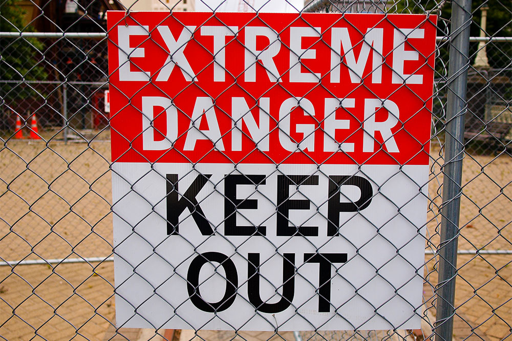
Colors are vital for compliance and quick recognition, with ANSI and OSHA standards assigning specific colors for hazard types. OSHA suggests safety words such as "danger," "warning," and "caution." Safety signs with the word "danger" should feature black text on a red background, while "caution" uses black text on yellow.
Note that some safety signs may not include predefined words.
Strategically place and position signs
Proper placement ensures signs are visible and understandable from a distance. They should be positioned to catch attention immediately and inform personnel of potential hazards. Regular reassessment and repositioning may be necessary to maintain optimum visibility, especially after modifications.